Recognize first
Large previews give users a visual memory cue before they read a folder name.
Independent product design · 2026
A visual file explorer concept that helps creative people recognize projects through images, spatial grouping and lightweight metadata instead of relying on filenames alone.
UX/UI Designer
Information architecture, navigation and visual hierarchy
Figma · Independent concept in progress
01 / Overview
The project began with a personal frustration: traditional file explorers are efficient when users remember exact names and locations, but creative work is often remembered visually. I explored a system where folders behave more like project tickets, combining a large preview, useful tags and a small amount of metadata.
Observed problem
References, textures, drafts and exports can disappear inside nested folders. Small icons communicate file type, but they do not always help someone remember what a project contains. My working hypothesis was that stronger previews and clearer grouping could reduce the effort of reopening older work.
This is a self-initiated design hypothesis, not a validated conclusion. The next phase is testing whether people find items faster with the visual system.
Design direction
Large previews give users a visual memory cue before they read a folder name.
The add control sits beside the content area instead of being buried in a distant menu.
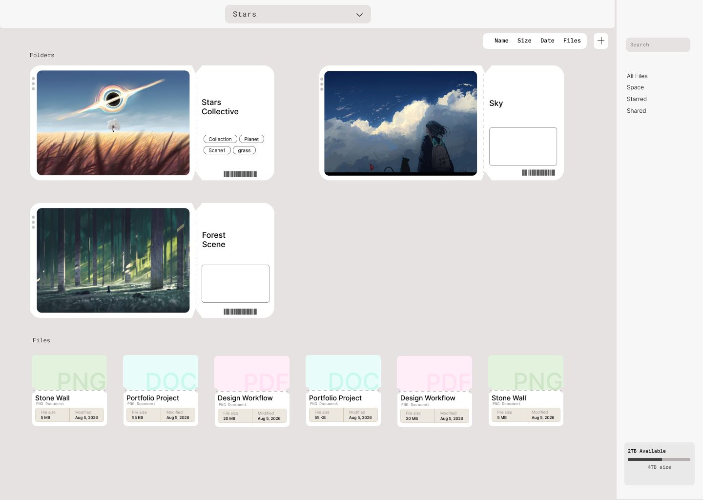
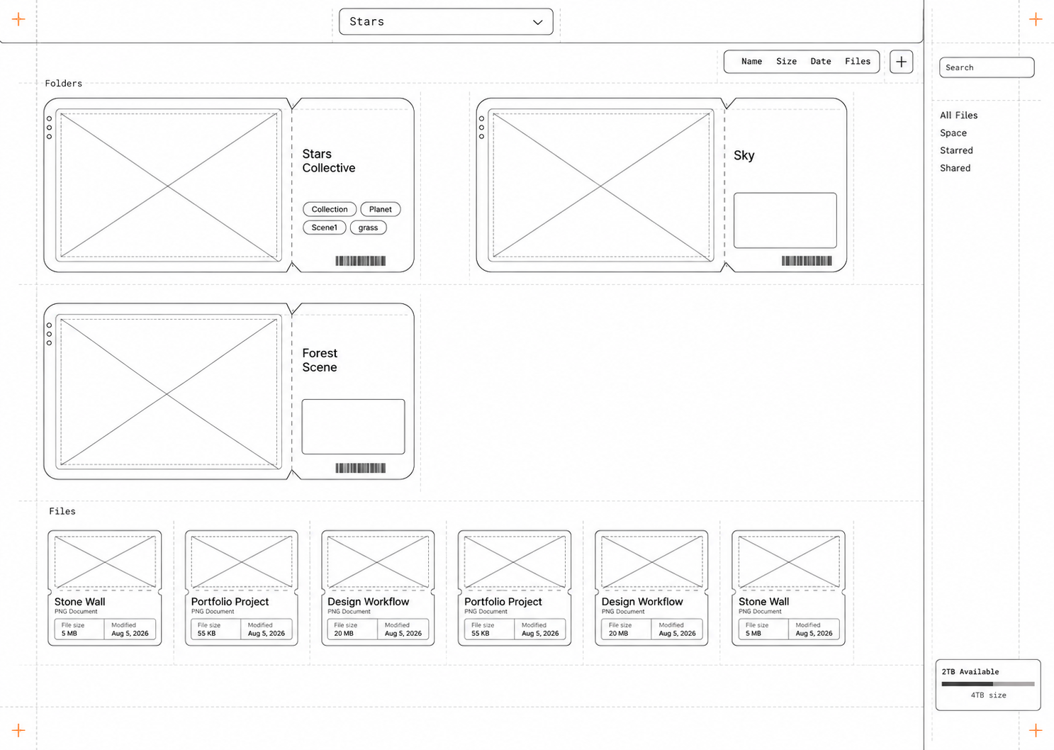
Large project tickets organize folders while smaller cards keep dense file collections scannable.
The navigation rail can be tested on either side instead of assuming one position works for everyone.
Key decision
The early idea used a single large column. It created a strong visual identity, but it also made comparison and reordering feel slow. Moving to two columns preserved the ticket metaphor while letting users see more projects at the same time. Inside a folder, the cards become smaller again so density matches the task.
One ticket dominates the workspace.
Clear, but too much scrolling and slower comparison.
More projects remain visible without turning the screen into a conventional list.
A compact thumbnail mode may make moving large ticket cards faster.
05 / System view
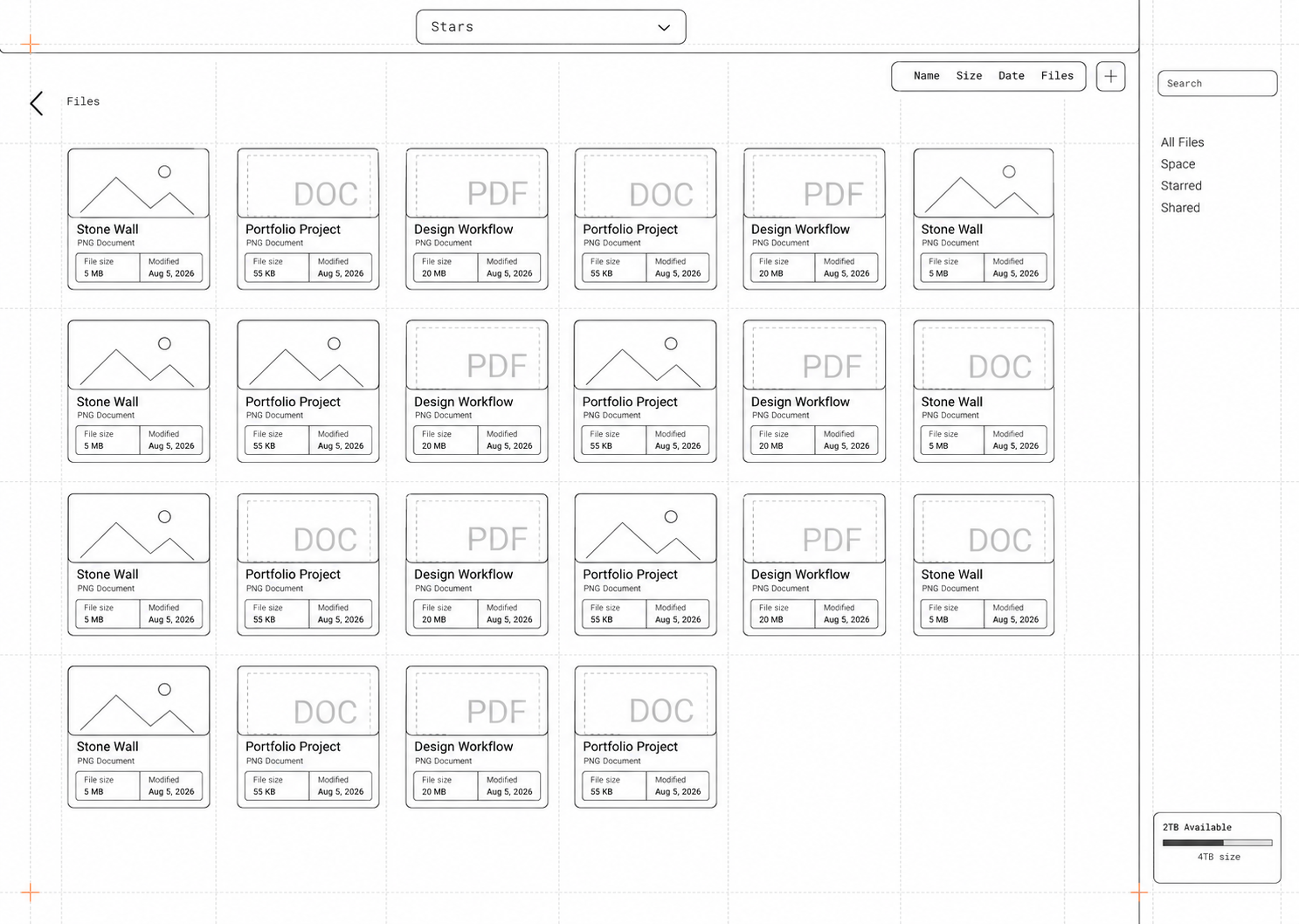
The outline studies remove the artwork and color so the hierarchy can be judged on spacing, grouping and repeated components alone.
06 / Final interface
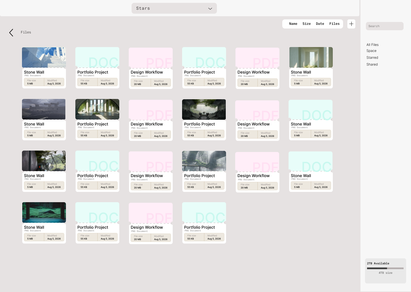
The folder view gives projects room to feel distinct. Opening a folder shifts into a denser grid where preview images, document types, sizes and dates can be scanned together. The right rail keeps global locations visible without competing with the work area.
What this project taught me
The strongest part of the concept is not adding more imagery everywhere. It is changing the amount of imagery based on context. Project-level folders benefit from large previews, while file-level browsing needs smaller repeatable cards. That balance keeps the experience expressive without sacrificing speed.
Validation plan
The next prototype will measure whether users can locate an old project, move a folder and identify a file from its preview without confusion. I also want to compare left and right navigation placement, then test a compact mode for faster reordering.