Independent UX/UI redesign · 2026
SPOTIFY
CLARITY
A focused exploration of how fewer visible columns can give recommendation artwork more room without reducing access to more music.
Role
UX/UI Designer
Focus
Content density, scanning, discovery
Status
Concept and design hypothesis
01 / THE QUESTION
Observation
When everything asks for attention, discovery becomes harder.
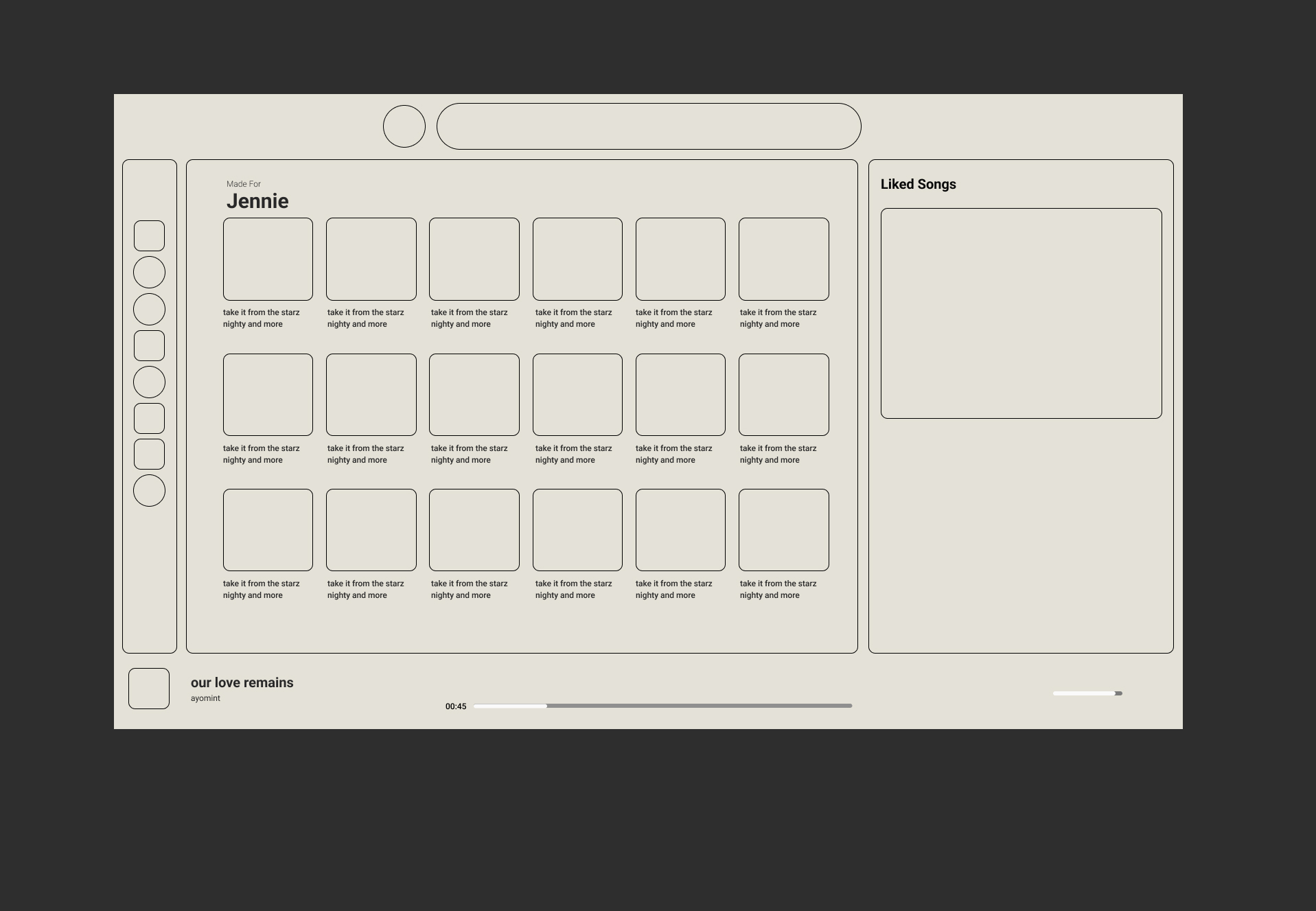
Spotify’s artwork supports fast recognition, but six small cards across the main area made the screen feel visually compressed. I explored whether a steadier four-column rhythm could create clearer hierarchy while preserving the amount of content available.
02 / Core decision
Keep four columns visible. Let the rest scroll.
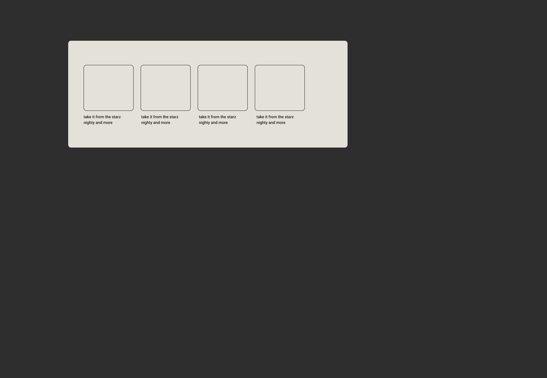
The redesign does not remove recommendations. It changes how they enter the frame: four larger cards stay readable while additional items remain available through horizontal scrolling.
Six cards share the visible area.

Reduce density without hiding the library.
Larger cards give album artwork and labels more room to be recognized. A consistent four-column view also keeps the browsing rhythm stable instead of shrinking cards to fit more choices into one frame.
01 / ScanMake each option easier to distinguish.
More space separates artwork, title and neighboring choices.
02 / BrowseMove overflow into intentional scrolling.
More recommendations stay available beyond the first four.
03 / FocusUse artwork as the primary visual anchor.
Labels support recognition instead of competing with the image.
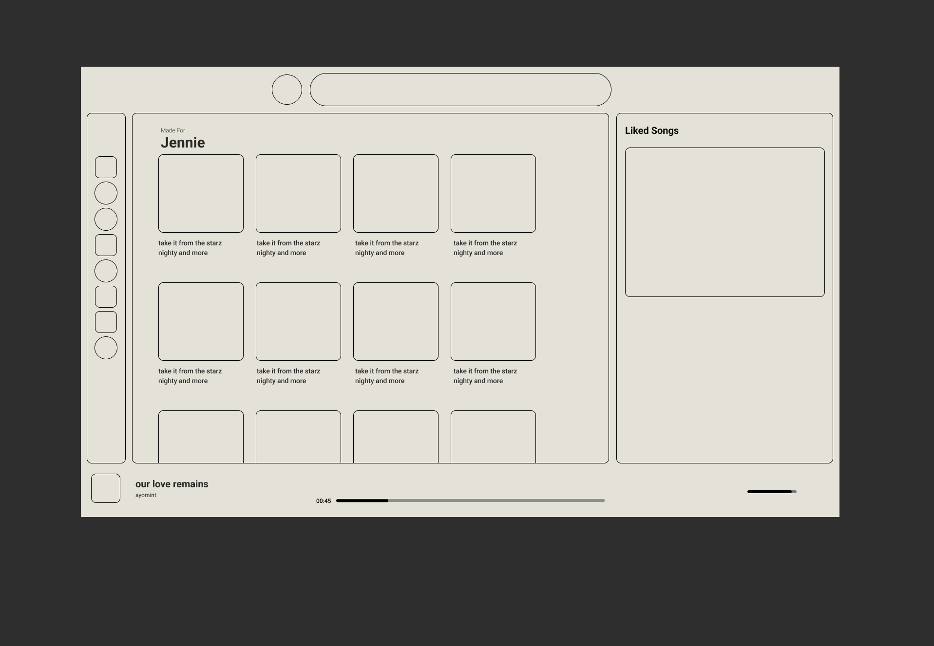
The full page keeps the same navigation, playback and saved-music zones.
The intervention stays concentrated in the recommendation area. That makes the change easier to evaluate without redesigning every part of the product at once.
05 / Visual direction
Color creates identity. Spacing creates control.
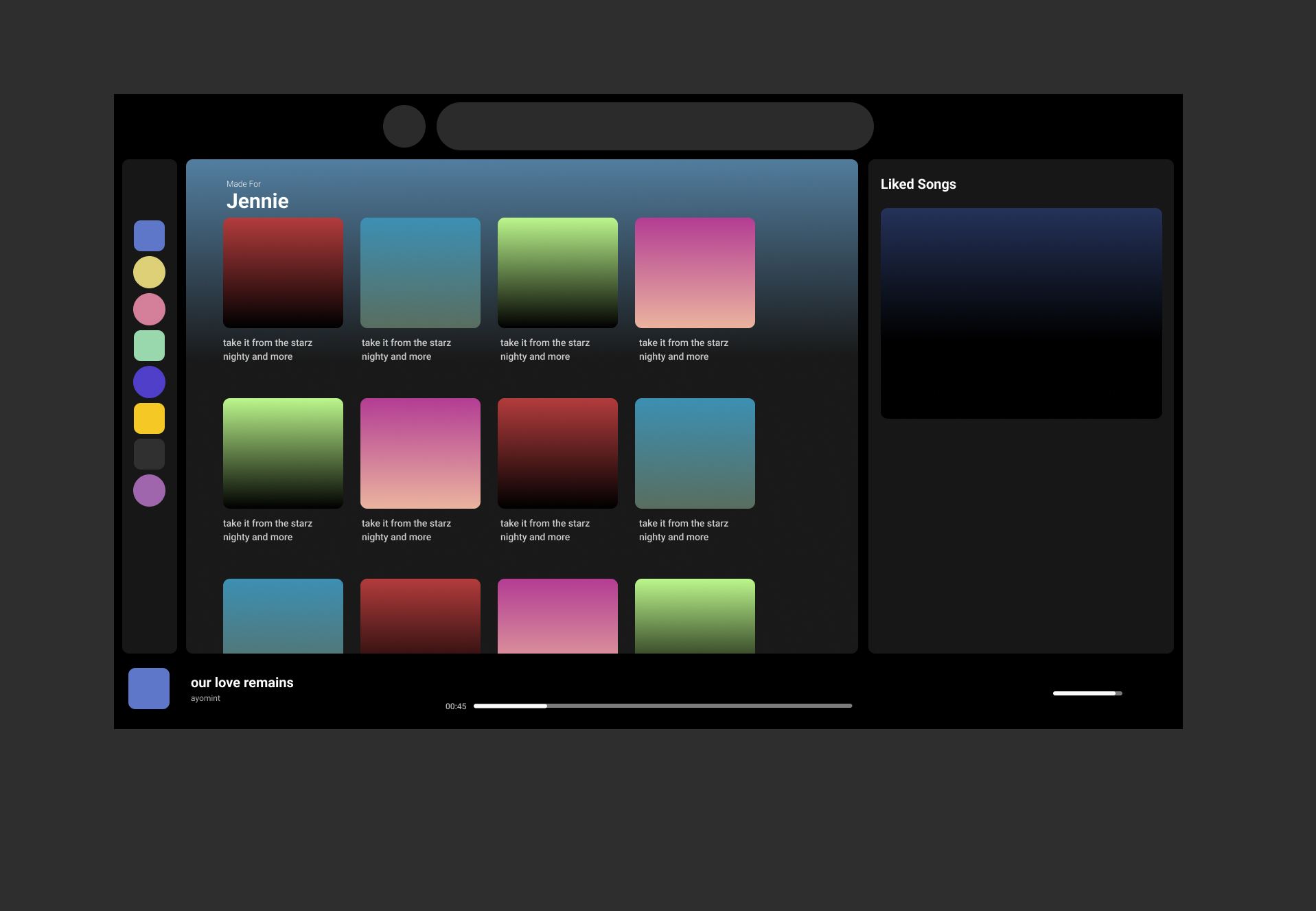
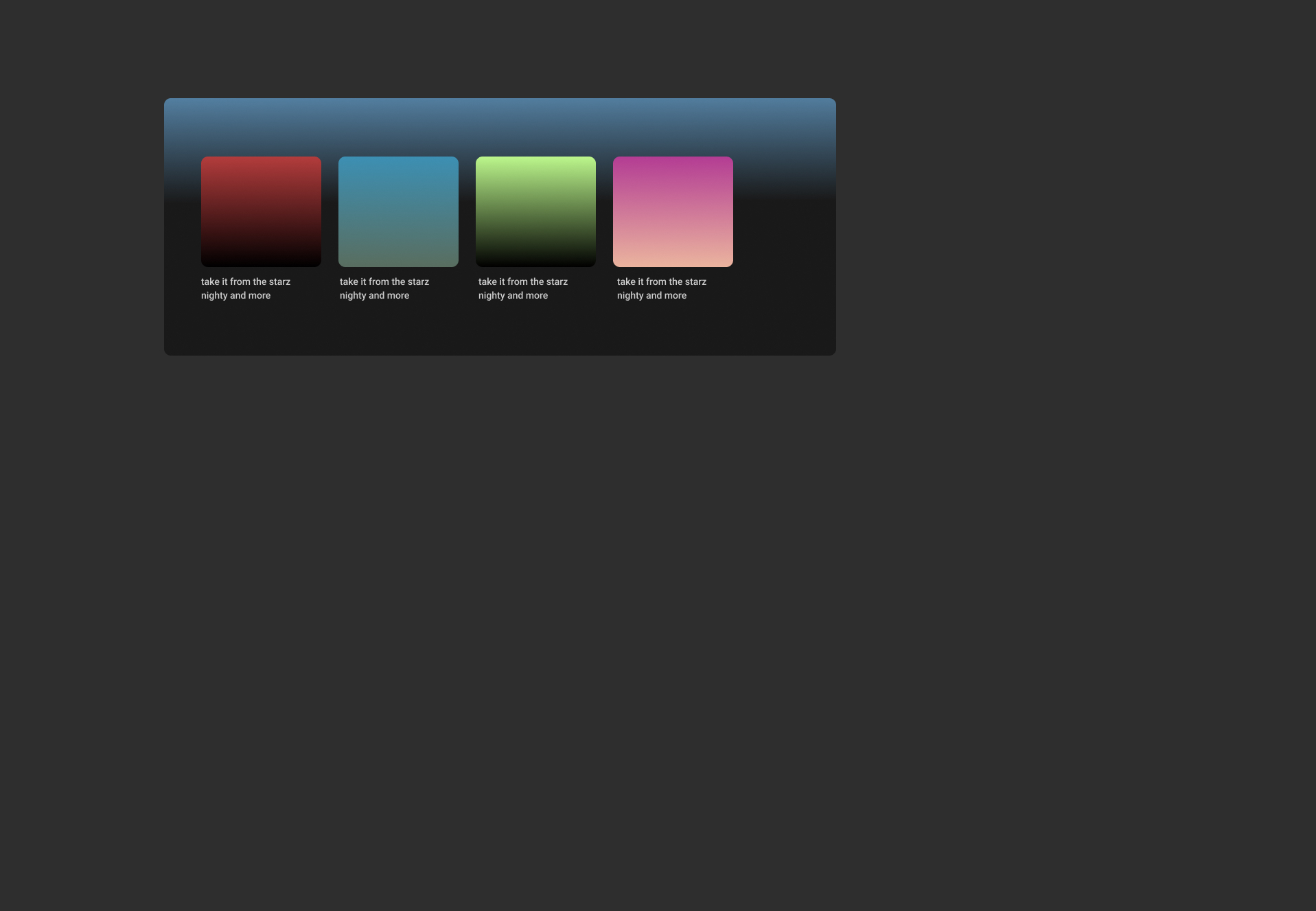
The colored concept uses gradient artwork as the main signal while the dark shell recedes. The four-column structure protects the breathing room established in the wireframe.
The direction still needs evidence.
This is a design hypothesis, not a claim that four columns are universally better. The next step is to compare both layouts with people completing the same music-finding tasks.