Clear tour descriptions
Visitors could understand what the tours included before booking.
Brand identity · Web design · Student project
A Long Beach-focused redesign that connects local history, architecture and waterfront culture across one visual system.
Brand, web and visual design
Identity, destination storytelling and consistency
Landing page, brochure and social posts
01 / Overview
The project reframed LA Walking Tours for a Long Beach audience. Research, a creative brief and two moodboards led to a new identity that could work across a landing page, printed brochure and social media.
Finding the gap
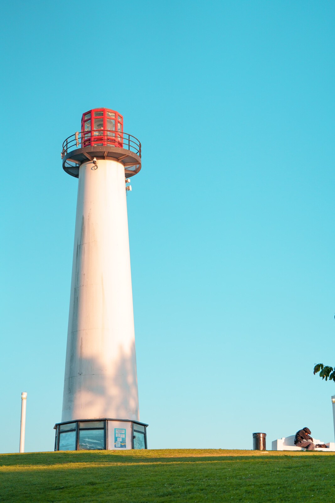
The original experience explained what visitors could expect, but its visual identity did not strongly communicate the city or create a consistent group experience. Competitor research showed that trust and clarity mattered, while the redesign needed a stronger sense of local character.
Visitors could understand what the tours included before booking.
Color, photography and form could make the experience feel specific to Los Angeles and Long Beach.
The concept focuses on people interested in history, film, art and architecture.
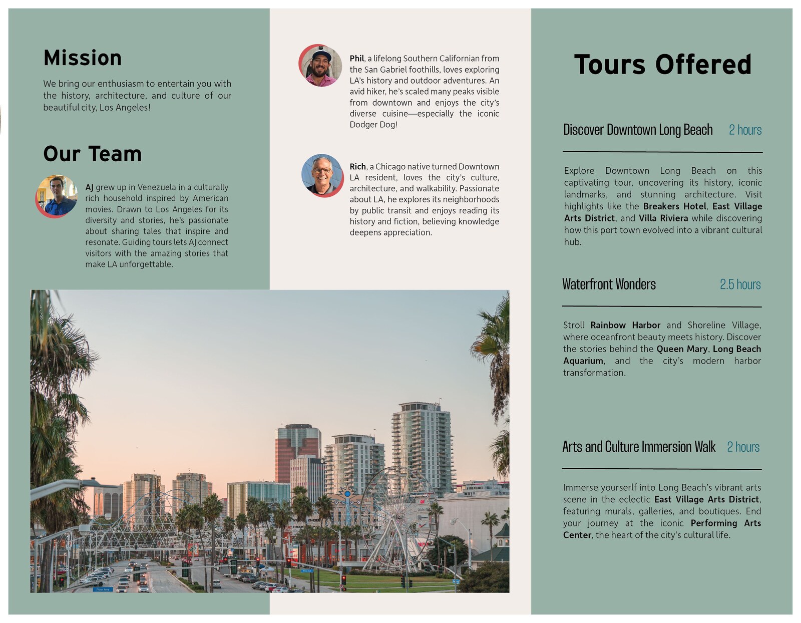
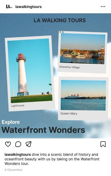
The redesign focused on three Long Beach experiences: Discover Downtown, Waterfront Wonders and an Arts and Culture Immersion Walk.
03 / Visual direction
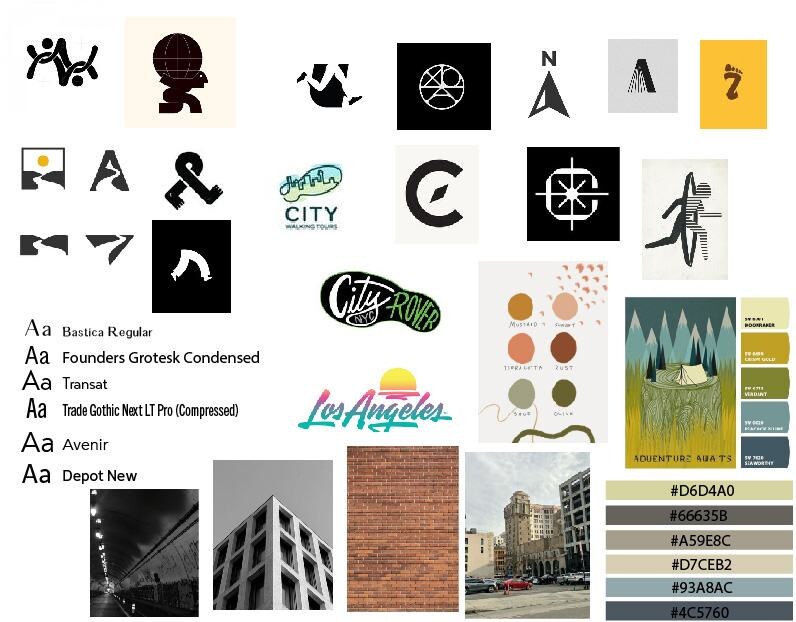
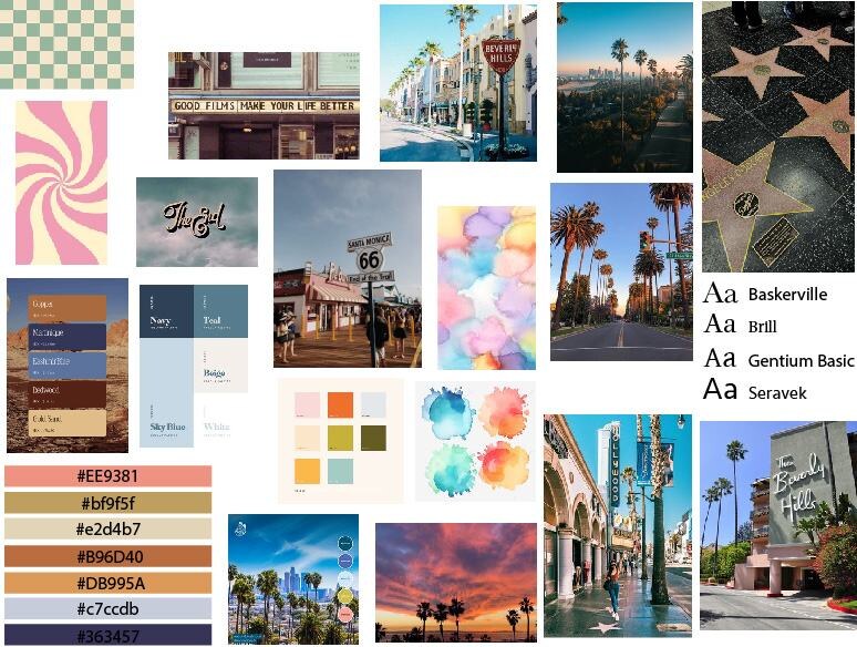
The first direction used simple sans serif type, architectural references and muted city colors. The second explored retro LA signage, warmer colors and a stronger connection to history.
Logo system
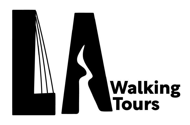
The L takes cues from architectural structure. The negative space inside the A becomes a winding path, connecting the city initials directly to the act of walking through it.
05 / Applications
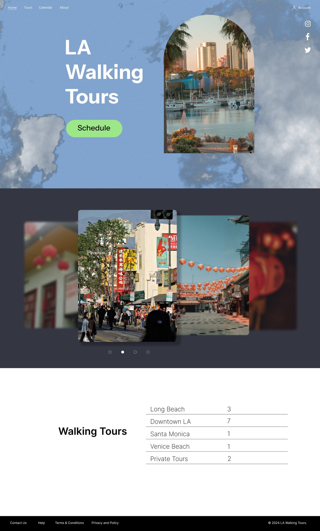
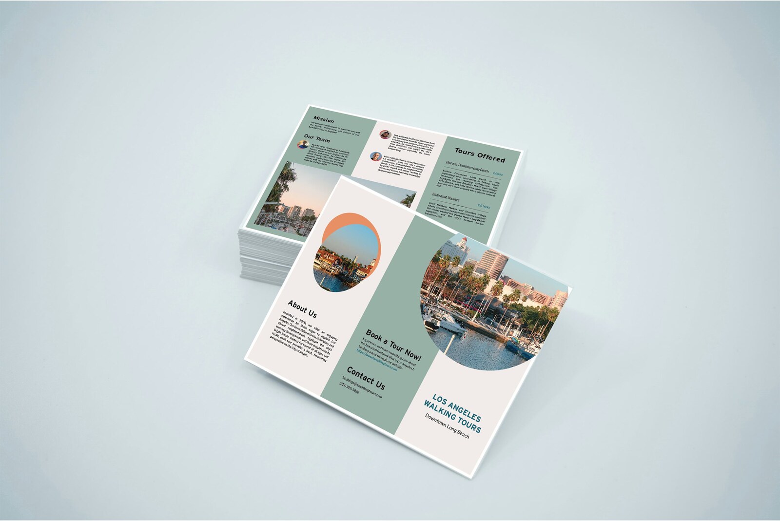
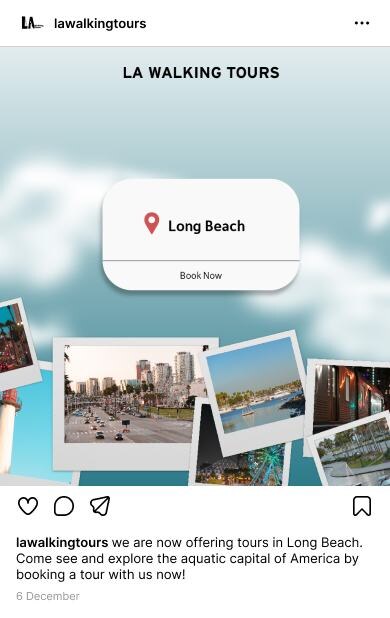
The teal, cream and photographic system carries the same destination story through each format. Select a format below or let the preview change automatically.
What the project demonstrates
The strongest outcome is the connection between location photography, the LA path mark and a repeatable color system. Instead of treating the website, brochure and posts as separate pieces, the redesign gives each one the same sense of place.
What I would test next
The next step would move beyond the visual package and test whether people can compare the three tours, understand the Long Beach focus and reach booking information without confusion.